In This Chapter
▶ Creating and using a control chart
▶ Looking at different ways to display data
Recognizing the importance of Control Charts
Real Story] Walter Shewhart, who felt that business wasted too much time confusing the types of variation and taking inappropriate action, developed control charts in the 1920s. Shewhart envisaged the control chart as a way to simplify identification of deviation. He knew his control chart should be a run chart showing the mean average, and also the upper and lower control limits (UCL and LCL). These upper and lower control limits show the natural range of the process results - but he was uncertain where to place these control limits.
Shewhart conducted thousands of experiments to determine the most appropriate position for the control limits. Using the data from the sub-group or sample taken, he discovered that the best positions were at plus and minus three standard deviations from the mean. The standard deviation was explained in the previous chapter. #1 린 식스시그마란? - 정의(Defining) beho.tistory.com/2
#1 린 식스시그마란? - 정의(Defining)
Introducing Lean Thinking Since Henry Ford's first production line, Lean thinking has evolved through several sources and over many years. Still, much of the development has been led by Toyota th..
beho.tistory.com
One standard deviation tells you the average difference between any one-process result and the overall average of all the process results. It's a measure of variation and at plus one and minus one standard deviation from the mean average, you're likely to incorporate almost two-thirds of your total results. At plus and minus two standard deviation, you cover approximately 95 percent of the results and setting the control limits at plus and minus three standard deviation includes 99.73 percent of the data. You don't need to think about the statistics at the moment though. Shewhart chose to place the control limit at these points because here they work most effectively and economically to distinguish between natural and special cause deviation.
Over time, many statisticians have reviewed Shewhart's experiments and concluded that Shewhart got his limits exactly right.
Creating a control chart
Control limits are calculated using the actual results from your processes. The control limits are not what your manager would like them to be, or what the customer is looking for. They present the voice of the process and enable you to see what's happening for real.
Using the results from a process, you can calculate the mean of the first 20 points, represented by a central line on the control chart, together with the control limits, denoted by UCL and LCL. These control limits present the natural variation of the readings. Please look at the control chart in the below figure.
Building on our example from the run chart explained in the previous chapter, we've built in some more data for Location A and Product 3. #12 데이터 제공하기 - Presenting Your Data beho.tistory.com/15
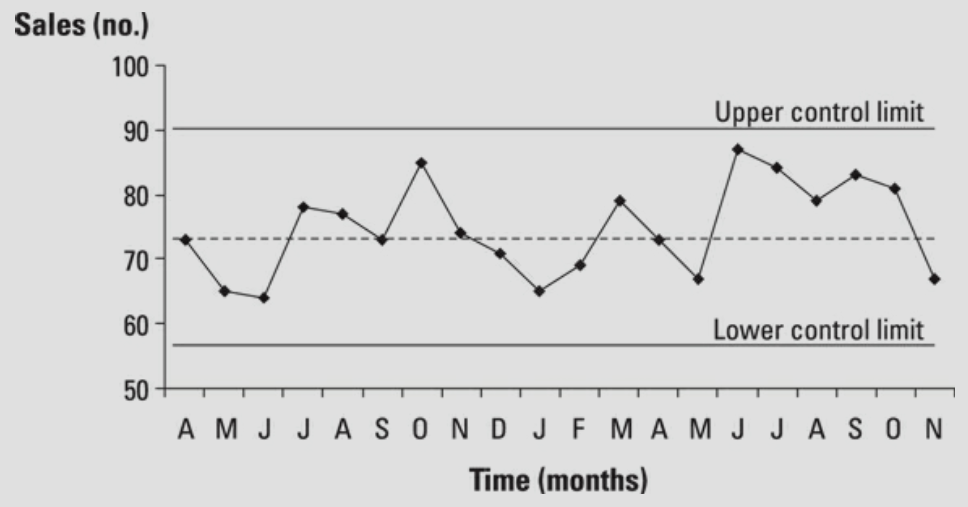
The chart shows that the sales process exhibits variation, and that is natural. Because all the data fall within the control limits, the reading reflects natural variation. This won't be always the case and you'll need to look out for unusual patterns in the data.
If a process exhibits only natural variation, then it is in statistical control and is stable. Being stable means that the process results are predictable and you'll continue to get results that display variation within the control limits.
Not reacting to individual data items is the key.
Just because all your readings reflect a process that's under control, stable and predictable, doesn't mean your results are necessarily good. For example, you might find a large gap between the voice of the process and the voice of the customer. (please see the chapter, #4 고객의 니즈(Needs) 파악하기 Part 1 - Understanding Your Customer beho.tistory.com/5)
You might not realize it, but your processes are trying to talk to you and you need to listen. Control charts provide an effective way to understand the voice of the process.
Because the process is stable, you can at least review the whole process to find improvement opportunities.
When you take action to improve the process, you must update your control chart to show the changes. Charts should provide a 'live' record of what happens - a 'clean' control chart probably isn't being used properly.
Unearthing unusual features
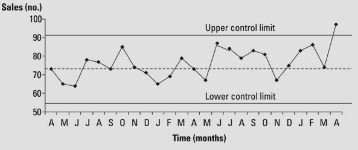
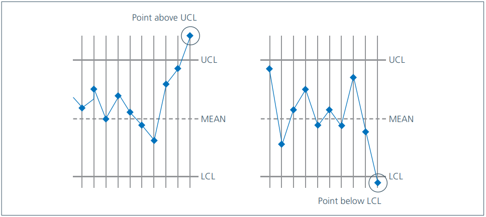
You can identify special causes of variation in a number of ways. Noticing when a data item appears outside the control limits is an obvious one, as we can see in the below figure.
You also have some special causes to contend with if you spot a run of seven consecutive points that are all:
- Going up
- Going down
- Above the mean
- Below the mean
Also, watch for two other anomalies:
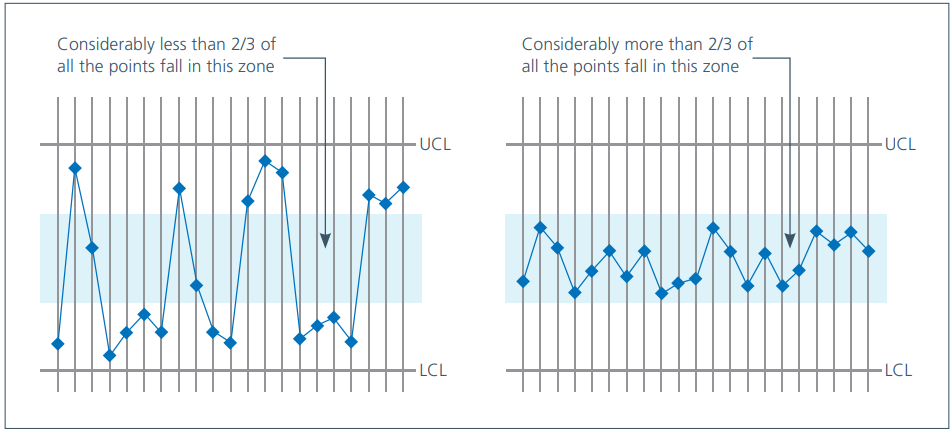
- The middle third rule, which is based on the assumption that approximately two-thirds of the data will appear in the middle third of your control chart. This brings us back to standard deviations. The middle third of the control chart covers plus and minus one standard deviation, approximately two-thirds of your population data. If the spread of the data is out of line with this pattern, a special cause may be responsible. Please see the figure below for the middle third rule.
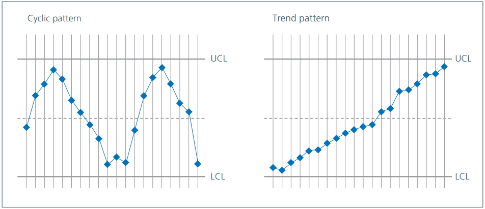
- Unusual patterns or trends, where, for example, something cyclical is occurring or data is drifting upwards and downwards over time, but isn't by itself offending any of the other rules.
In this chapter, we will concentrate on the most important signal - a data point outside the upper or lower control limits. You need to find the root cause and then either prevent the special cause from occurring again (if the result is bad) or build the special cause into the process (if the result is good).
In the figure 'Occurrence of a special cause outside a control limit', you can see a point outside the control limits. This probably indicates a special cause and you need to investigate it, but be aware that very occasionally you will find a point outside the control limits that is a natural part of the process and lies in the small proportion of data outside the 99.73 percent covered by the control limits. This is known as a false alarm, though you won't know that, of course, until you've investigated.
Maybe you know why the April sales figure is unusually high. Perhaps you ran a special promotion, coupled with the provision of a range of extra resources, resulting in a sale figure out of line with the previously expected values - and therefore outside the control limit. This represents a good special cause - you need to see if you can build it into the process and use it as part of the improvement strategy.
A special cause that most people are pleased to see is the proof that a change in the process has been successful. The below figure shows a situation where a process review has been carried out and improvement action taken.
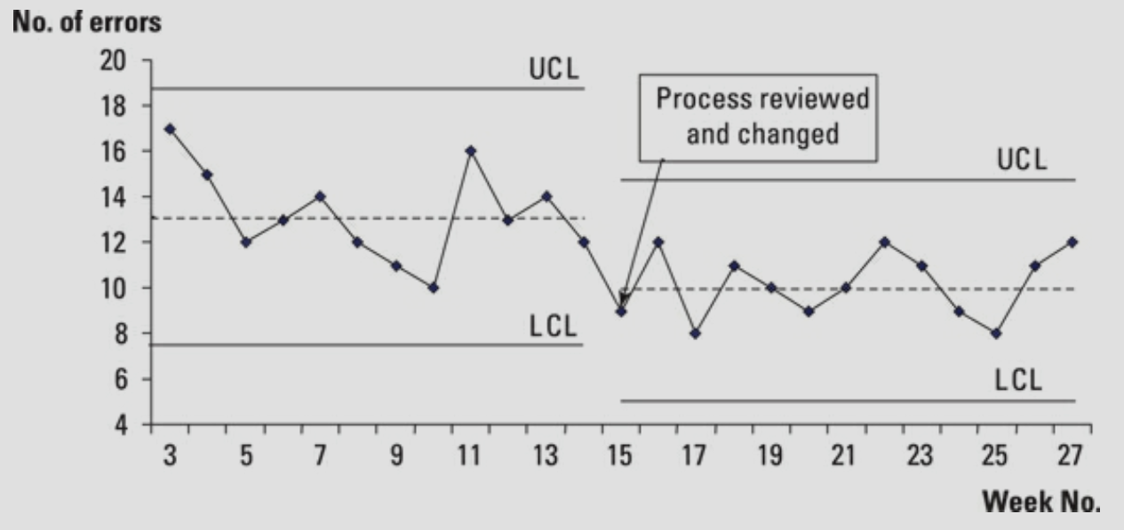
The results that follow the change to the process are all below the original mean (the dotted line), reflecting an improvement in the process. The control chart gives us evidence of a change for the better - in this case, seven consecutive points below the original mean. You can now recalculate the control limits and head down a track that may highlight new special causes to be actioned. Reducing variation is one of the key principles of Lean Six Sigma and that's exactly what you are seeing in the above figure.
Choosing the right control chart
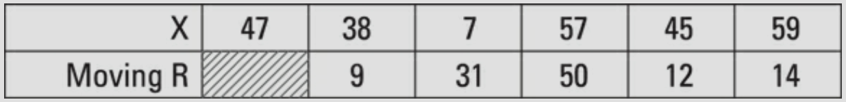
You can use a number of different SPC charts, broadly they all follow the same concepts and rules, but broadly they all follow the same concepts and rules. Of the available control charts, the X moving R, or individuals, chart is the most versatile. In the X moving R chart, the 'X' represents each of the data points recorded - perhaps a series of sales volumes or the time taken to process each other. 'Moving R' describes the moving range - the absolute difference between each consecutive pair of Xs, as shown in the below figure.
This chart is ideal for measuring a variety of things, such as cycle time performance and volumes, and to present attribute data such as proportions or percentages by treating them as individual readings.
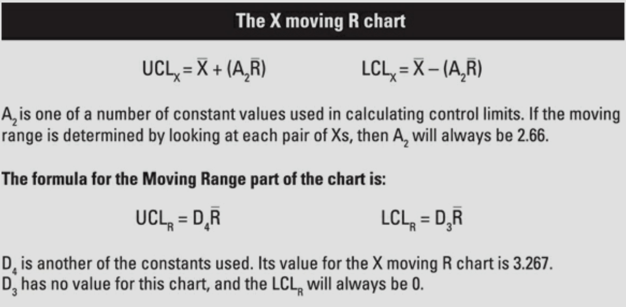
The next figure shows the formula for the X moving R chart. The UCL and LCL represent the upper and lower control limit for the X data. The X with the little bar above it (X bar) is the mean average of all the Xs in the data you're using to construct your chart. R bar is the mean of the moving range values you calculate.
In addition to the control chart for the X values, you can also create a chart for the moving range values. The formulae make use of 'standard constant' values.
Control charts are the key technique in the analysis, control, and improvement of processes.
Examining the state of your processes
A process can be in one of four states, which provide the basis for more effective discussion and action, as shown in the below figure.
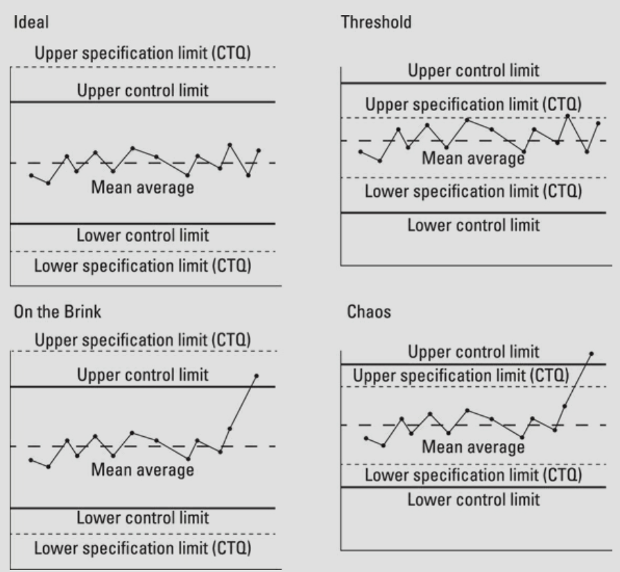
- In an ideal state, the process is in statistical control and meets the customer's requirements. If you use a traffic light system at your operations meetings, you can think of this state as a 'green light'. By continuing to use the control chart, you can monitor the process and make sure it remains ideal. You may also want to improve on ideal - perhaps by delighting the customer or reducing the costs associated with the process - but to do that you need to implement an improvement project that looks at the whole process.
- a Threadhole state (or amber light) describes a process that's in statistical control but doesn't meet the customer specifications. You don't need to discuss the variation between this week's and last week's numbers, because the process is predictable. Assuming a DMAIC improvement project is initiated, your ongoing discussions will concern the progress you make.
- When a process is in on the brink stats, it meets the customer specification, but it isn't in statistical control. The process has special causes and is unpredictable. This is a red light situation - at any moment, the process may slip into chaos.
- Chaos - the serious red-light state - describes the process that isn't in statistical control and doesn't meet the customer specifications. By continuing to use the control chart, you can monitor the removal of special causes and the eventual improvement and stability of the process. Removing these special causes from the process before you begin to change is important. If you don't, they'll likely impede your efforts to improve.
In a culture of continual improvement, moving to an ideal state via a threshold performance is fine. Improvement efforts always focus on bringing the process into a state of statistical control first - special causes can confuse your improvement efforts if you don't understand the interactions they are causing.
※ 참조: 본문은 책, "Dummy들을 위한 린 식스시그마(Lean Six Sigma)"와 The Toyota way를 정리한 내용을 기반으로 제 경험들을 조미한 글입니다. 현재는 원서 기반으로 내용을 정리하고 있는 중이며, 정리가 완료되면 한글로 번역을 추가할 예정입니다.
'Lean Six Sigma' 카테고리의 다른 글
| #15 수행 영향 분석하기 - Analyzing What's Affecting Performance (0) | 2021.04.14 |
|---|---|
| #14 공정능력 확인하기 - Capability study of the process (0) | 2021.04.12 |
| #12 데이터 제공하기 - Presenting Your Data (0) | 2021.04.04 |
| #11 샘플링은 어떻게 해야 할까? - Introducing Sampling (0) | 2021.04.01 |
| #10 필요한 정보 모으기 - Gathering Information (0) | 2021.03.27 |


